CalAnimals
CalAnimals is a nonprofit organization that supports animal shelters and rescue groups across California by providing training, legal guidance, and emergency support to improve animal care statewide.
My Role
Duration
Tools
Prototype Link
Lead Ui/Ux Designer
5 Weeks
Figma, Google forms, Google slides, Jira, Slack, Adobe Photoshop
Overview
Problem
Goal
The CalAnimals website is difficult to use, and users such as shelter staff and volunteers struggle to find training, legal information, and support. The site has confusing menus, unclear buttons, and lacks accessibility, which makes it less helpful.
The goal of this project is to make the CalAnimals website easier to use. The old site had confusing menus, unclear buttons, hard-to-read text, and cluttered content. The new design will be clear, simple, and helpful for all users.
Research
To begin our redesign journey, we first needed to gain a deep understanding of the existing CalAnimals website experience. We explored how users interacted with the site, assessed its usability, and identified gaps and opportunities for improvement.
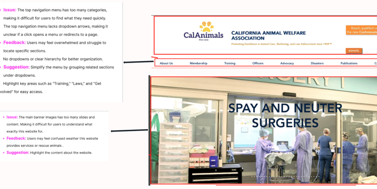
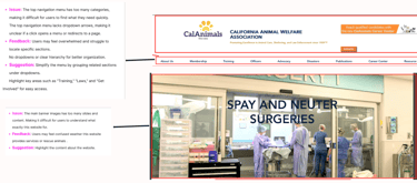
Heuristic Evaluation
We evaluated the CalAnimals website using design principles such as visual appearance, content clarity, navigation structure, and overall functionality. This helped us uncover major usability issues.
The interface lacked clear guidance for users
Navigation was inconsistent and confusing
Important feedback and error prevention features were missing.
Key Takeaways:
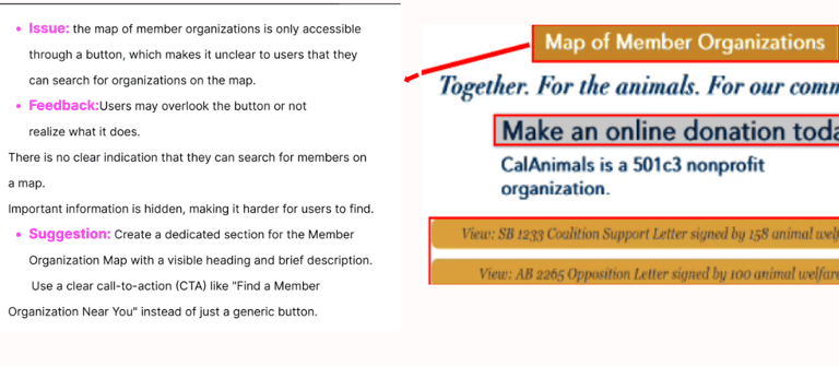
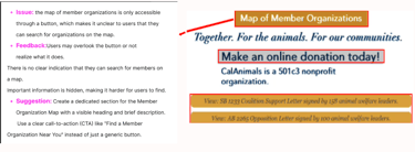
Website Annotations
We annotated several web pages to study the layout, grouping, and flow of information. This revealed a lack of visual hierarchy and poor organization, making it difficult for users to find what they were looking for.
Key resources were buried deep within the layout.
Buttons lacked visibility and clear purpose.
Content wasn’t logically grouped, increasing cognitive load.
Key Takeaways:
User Tests
We conducted usability tests with participants who interacted with the existing site. While they agreed that the site had useful content, they found it difficult to access efficiently.
User Interviews
We conducted one-on-one interviews with animal shelter staff and volunteers to understand their goals, frustrations, and behaviors. These conversations revealed that users often struggled to find basic resources, felt overwhelmed by the cluttered layout, and were unsure which actions to take first.
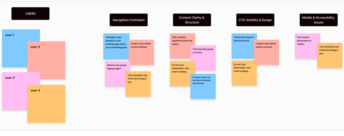
Key Takeaways:
Users wanted fewer clicks to access key resources.
Most were unaware of hidden content, such as legal updates.
They preferred a simpler layout with clearer next steps
Key Takeaways:
Users struggled to quickly find training and legal support.
Confusion arose from similar-looking links and pages.
Participants expressed frustration, despite recognizing the site's value.
Definition & Development
User Persona
We created a persona representing our core user — a shelter manager juggling many tasks who needs quick, clear access to resources. This persona guided all of our design decisions.
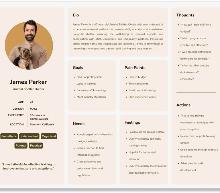
Key Insight:
Our users weren’t just lost—they were overwhelmed, frustrated, and short on time. The site needed to be simple, fast, and supportive.
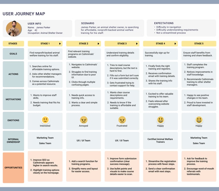
User Journey Map
Mapping the user journey revealed specific points of friction: unclear CTAs, scattered content, and inconsistent structure. This helped us prioritize what to fix first.
Problem Statement
“I know the information is there—I just can’t find it.”
This quote summed up the biggest issue with the CalAnimals website: the content was valuable, but it was buried beneath cluttered layouts and confusing links.
Key Problems We Identified:
Confusing navigation and redundant CTAs
Poor accessibility and low contrast text
Important content buried too deeply
Our Mission: Redesign the website to make navigation intuitive, highlight key actions, and ensure accessibility for everyone.
Ideation & Strategy
Mind Mapping
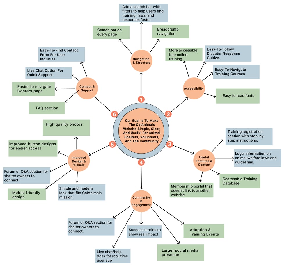
After gathering insights from James’s user persona and the user journey map, we created a mind map to organize and prioritize the needs and pain points. This helped us focus on what matters most to animal shelter owners using the CalAnimals website.
$100 Bill Test – Process & Result
Each team member spent $100 on the features they found most important.
We reviewed the results and selected the top three features with the most votes.
We discussed the close contenders and chose one main focus for prototyping.
Winning Idea: Useful Features & Content
Easy training registration with step-by-step guidance.
Simplified legal information on animal welfare laws.
Searchable Training Database for quick access.
Membership portal that keeps users on the website.
Summary of Our Discussion & Decision
Our team agreed that improving useful features and content is the most critical area. Many users struggle to find training programs, legal guidelines, and emergency resources. By enhancing these features, we can make information easier to access, reduce confusion, and better support animal shelter owners.
$100 Bill Test
To choose the best ideas for the CalAnimals website, we used the $100 Bill Test. Each team member received $100 to spend on the features they thought were most important from our mind map. This helped us identify the top ideas to make the website simple, clear, and helpful for shelter owners.
What We Did:
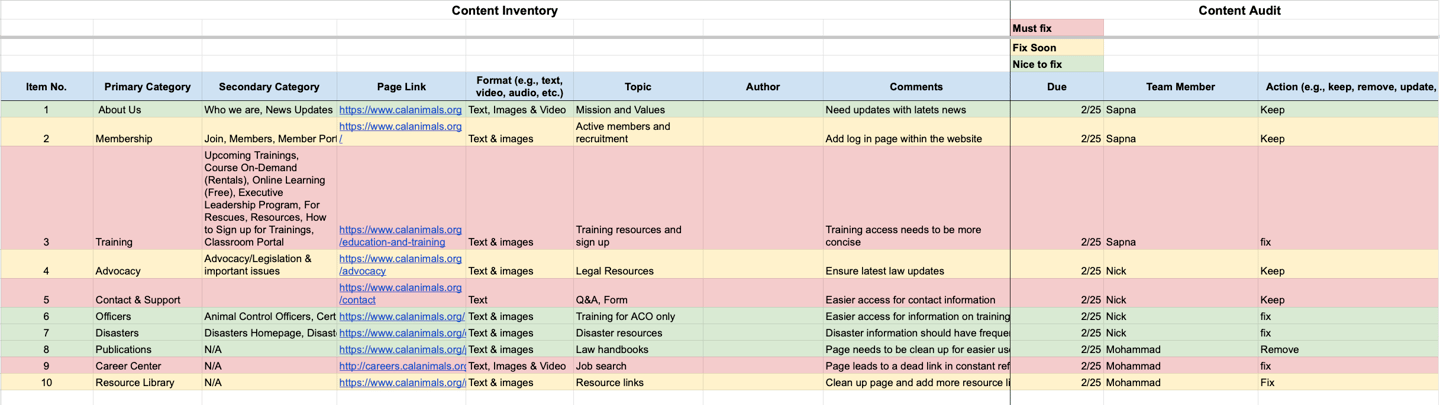
Reviewed each page on the CalAnimals website
Checked the content type, topic, and how usefulness
Marked content as: Must Fix, Fix Soon, or Nice to Fix
Suggested actions: Keep, Fix, Remove, or Update
Key Takeaways:
Important pages like Training & Resources needed a better layout and easier access.
Some pages, like Publications, were not functioning well and should be removed.
Legal and Advocacy content was useful and should remain, but the visuals need improvement.
This process helped us clean up the site and focus on presenting the right information clearly and quickly.
After the $100 Bill Test, we closely reviewed the CalAnimals website content to identify what was working and what needed improvement. This helped us decide what to keep, enhance, or remove to better support both user needs and business goals.
Content Inventory & Audit
Design & Prototyping
Once we defined our priorities, we moved into the design phase—bringing clarity, empathy, and usability to the CalAnimals platform.
Low-Fidelity Sketches
Before moving into visuals, we created low-fidelity wireframes using grayscale blocks to represent structure and layout. These early sketches helped us explore layout options and plan the user flow without being distracted by color or style.
Usability Testing
We conducted usability testing to observe how users interacted with our layout before moving to the next phase. We assessed how easily they could complete tasks, how the content flowed, and how they responded to the placement of calls to action (CTAs).
Key Changes We Identified:
The homepage CTA "Know More About Us" needed to be changed to "Become a Member" for better engagement
The “Donate” and “Contact” buttons looked too similar, causing confusion about which was more important.
The hero section CTA needed to be larger for better visibility
The training section required better contrast to improve readability.
Some button labels were unclear and needed simpler wording
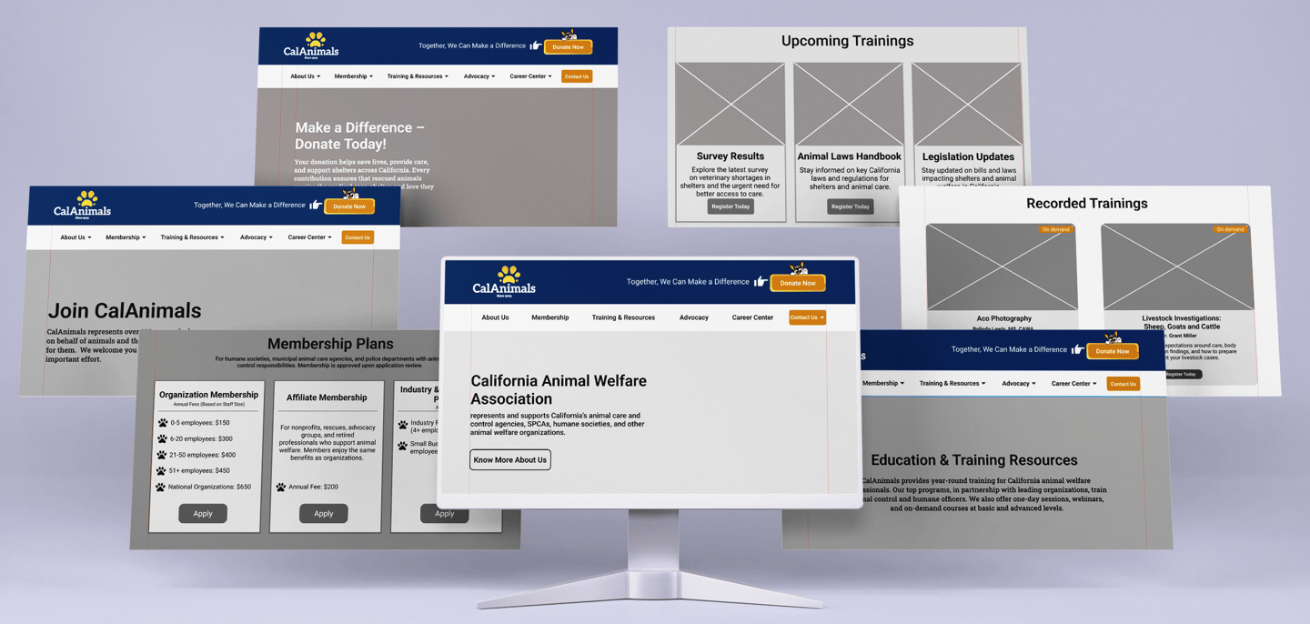
After finalizing the layout in low-fidelity wireframes, we moved on to mid-fidelity designs. These helped us test the layout flow and observe how users responded to early visual elements without full styling.
Mid-Fidelity Prototypes
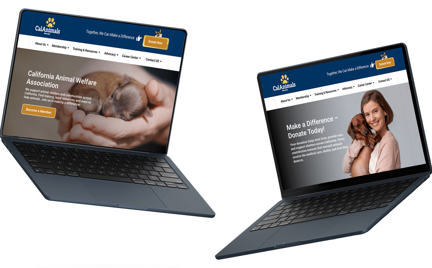
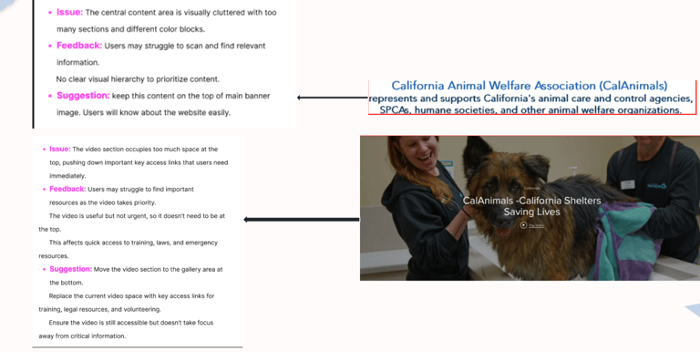
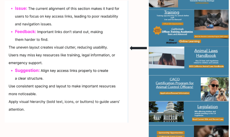
After: We simplified the layout, making it clean and easy to navigate. Key actions became easier to find, and content was better organized for quick access.
Before: The original website layout was cluttered, with inconsistent spacing, unclear hierarchy, and overlapping sections that confused users during navigation.
Final Impact
Our redesign transformed the CalAnimals website into a supportive and easy-to-use tool for its core users.
What Improved:
40% faster task completion.
Increased engagement with training and donation pages
Improved mobile responsiveness and accessibility compliance
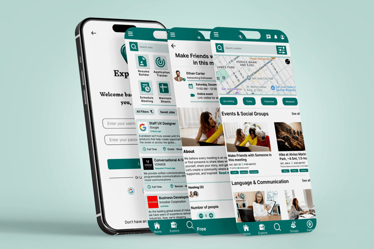
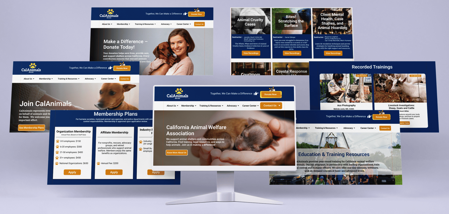
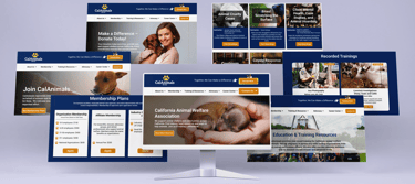
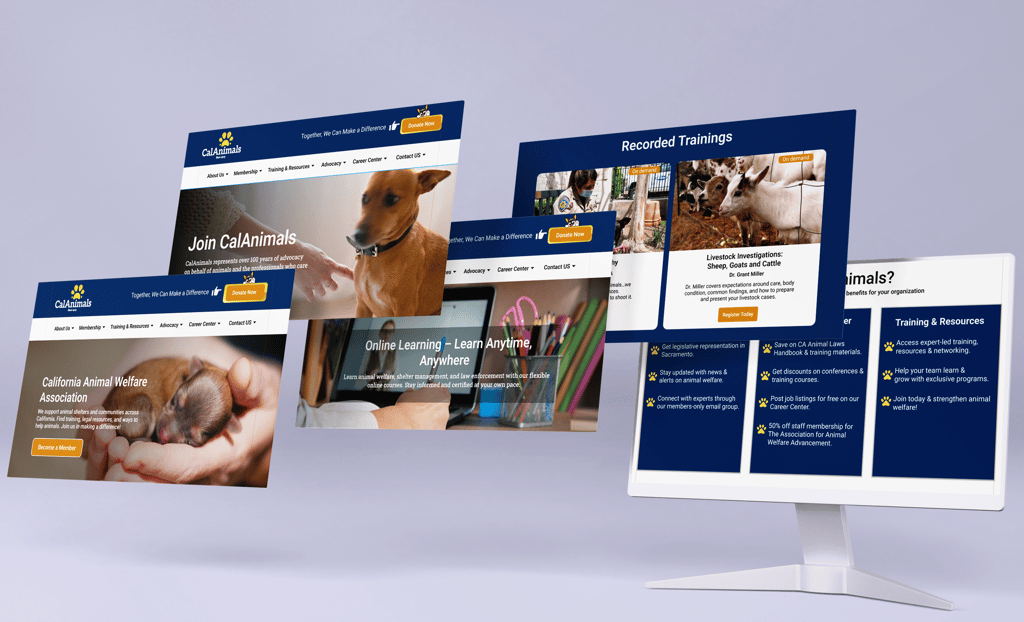
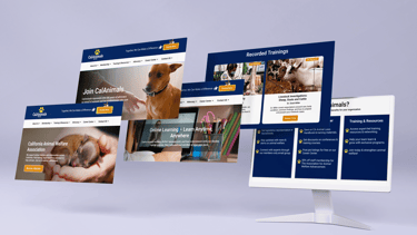
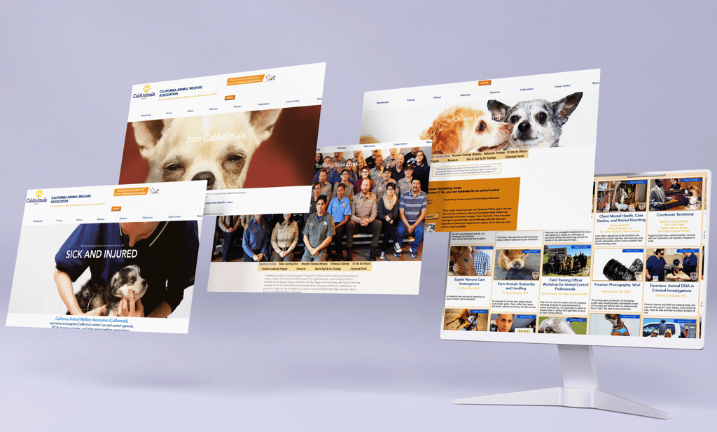
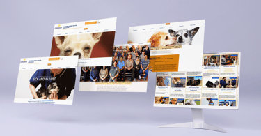
High-Fidelity Prototypes
Reflections & Learnings
This project reminded us that great design isn’t just about visuals—it’s about solving real problems for real people.
Key Takeaways:
Listening to users is the most powerful design tool
Simplifying design makes it more useful
Small UI changes can have a big impact
Accessibility isn’t optional—it’s essential
"Design isn’t just how it looks. It’s how it works." – Steve Jobs
View More Work
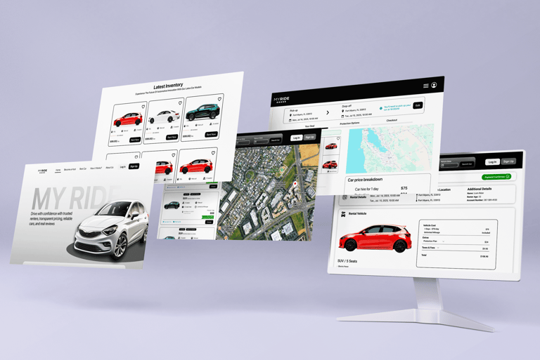
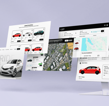
MyRide is a simple, fast, and stress-free car rental website with clear pricing, trusted reviews, and flexible options for both new and frequent renters.