MY RIDE
MyRide is a car rental website that helps people easily find, book, and use cars when they need them. It is fast, simple, and designed to be trustworthy and affordable for everyone.
My Role
Duration
Tools
Prototype Link
Lead Ui/Ux Designer
4 Weeks
Figma, Google forms, Google slides, Jira, Slack, Adobe Photoshop
Overview
Problem
Goal
Renting a car is often slow, confusing, and frustrating. People face long wait times, hidden fees, excessive paperwork, and unclear steps. Many also find it difficult to trust the process or get help when they need it.
Make car booking simple and fast
Show clear prices with no hidden costs
Build trust through reviews and safety checks.
Provide users with support when they need help.
Allow car owners to safely rent out their cars and earn money.
Research
Quantitative
32 survey participants (age 25–35)
Qualitative
Key pain points:
Hidden fees and unclear insurance policies
Confusing onboarding process and lack of support
Trust issues with peer-to-peer rentals
Key findings:
58% prefer traditional rental companies over apps like Turo
84% rent cars for travel
Price and reviews are the top decision-making factors.
44% do not trust renting someone else’s car.
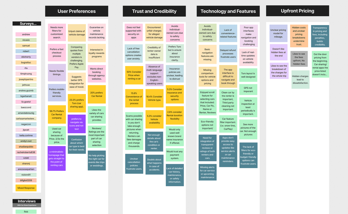
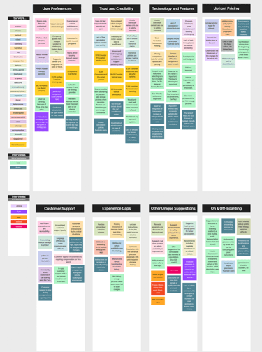
Affinity Diagram
We spoke with users and collected feedback through surveys and interviews. Then, we grouped their responses into themes to better understand their needs, problems, and ideas. This helped us identify what matters most when people rent a car.
Key Takeaways from Affinity Map:
Users want things to be simple and fast — with clear steps, easy filters, and detailed car information.
Price matters a lot — people dislike hidden fees and want to see the full cost upfront.
Trust is important — users worry about scams and prefer verified cars and honest reviews.
Support needs improvement — people want quick help, live chat, and clear answers.
First-time users feel lost — they need step-by-step guidance and easy instructions.
Pick-up and return processes are confusing — users want clear directions and photos of the car’s location.
Users suggested cool ideas — such as dark mode, reward points, and 360° car views.
7 user interviews
Key Takeaways (Liam):
Wants to book quickly with no hidden costs
Cares about trust, reviews, and good support
Gets upset if the car isn’t available or if help is hard to reach
Feels happy when things are clear and fast
Key Takeaways (Ryan):
Feels nervous and wants clear steps
Worries about extra fees or making mistakes
Needs helpful support and easy instructions
Feels more confident when the app guides him clearly


We created two sample users to understand real people’s needs: Liam, who rents cars often, and Ryan, who is renting for the first time. These personas helped us design a car rental app that works for both experienced and first-time users.
Behavioral Archetypes
Key Takeaways :
Wide variety of cars (from budget to luxury)
Confusing insurance and not beginner-friendly
Add insurance guides and build trust for new users
Turo
Expedia
Strong travel bundles (car + hotel + flight) with global reach
Outdated car rental design and hidden extra costs
Highlights an opportunity to offer clear pricing and a better design
Zipcar
Good for short city trips with easy access
Limited car choices; not ideal for travelers outside cities
A great example of fast booking and real-time car maps
Uber
Trusted brand with easy booking for short trips
Not ideal for longer rentals or custom needs
Opportunity to focus on flexible rentals and features Uber doesn’t offer
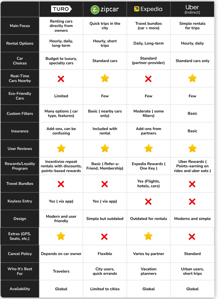

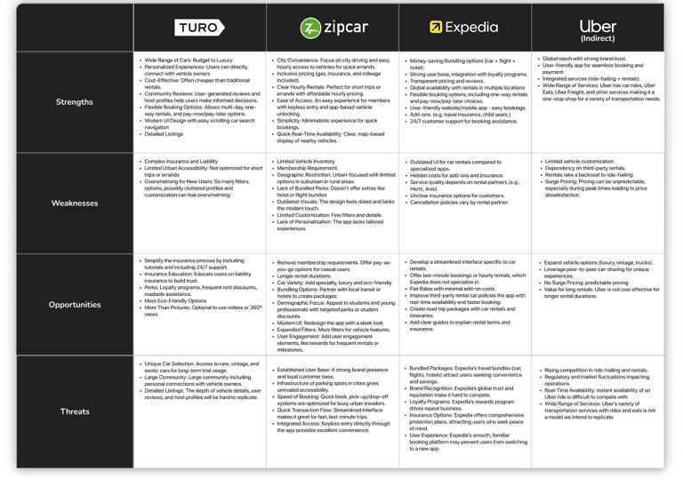
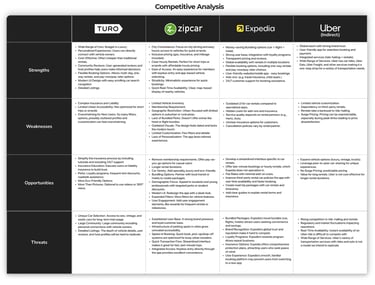
We compared Turo, Zipcar, Expedia, and Uber to understand their strengths, weaknesses, and features. This helped us identify gaps and opportunities for MyRide to offer a better, more user-friendly car rental experience.
Competitive Analysis
Ideation & Strategy
We used various tools to generate and organize ideas. The Creative Matrix helped us brainstorm new features, while the MoSCoW Chart helped us prioritize what’s most important. We also made Recommendations and outlined next steps to improve the app. Finally, we created a User Journey to show how a person would use the app from start to finish.
Creative Matrix
We used the Creative Matrix to generate ideas for different types of users, such as frequent travelers, first-time renters, and people who are not very tech-savvy. We focused on their needs related to pricing, support, safety, and booking.
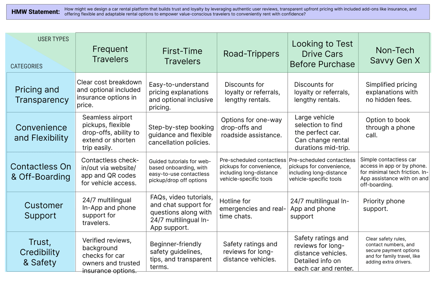

Key Takeaways:
Everyone wants clear pricing with no hidden fees.
New users need step-by-step guidance.
Frequent travelers want fast and flexible options.
Good support (such as 24/7 help or live chat) is very important.
Trust and safety matter — users want reviews and secure options.
Some users prefer simple booking tools, like phone calls.

User Journey Map
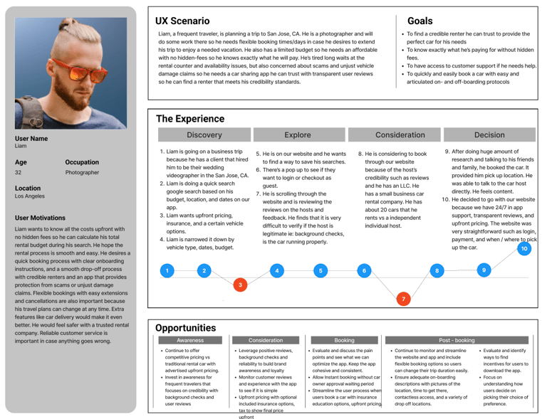
This journey map shows how Liam, a frequent traveler, books a rental car. It follows him step by step — from searching online to picking up the car. It helps us understand his needs, concerns, and what makes him feel confident.
Key Takeaways:
Liam wants to see full prices with no hidden fees.
He looks for trustworthy hosts with good reviews and background checks.
He needs simple steps to book, cancel, or change plans.
He feels more confident when he can contact the car host and get quick support.
He prefers apps that offer clear instructions and contactless pick-up.
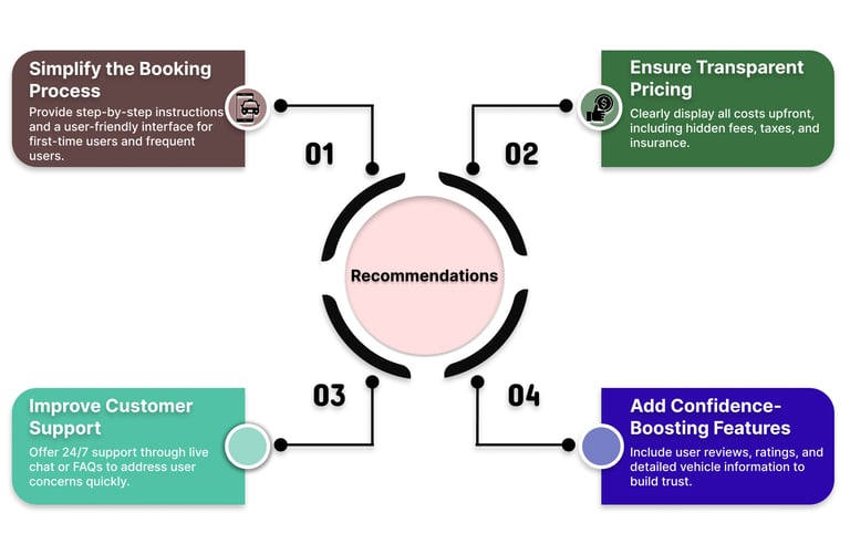
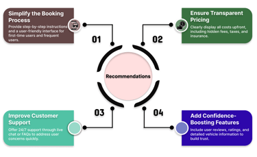
Recommendations
We made four key suggestions to improve the car rental experience.
Key Takeaways:
Simplify Booking – Add step-by-step guidance for first-time users.
Show Transparent Pricing – Include all costs upfront (no hidden fees).
Improve Support – Provide 24/7 live chat and helpful FAQs.
Build Trust – Use ratings, reviews, and detailed car information to help users feel safe.

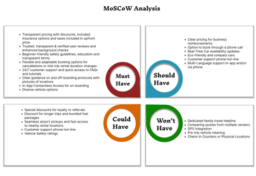
MoSCoW Method
We used the MoSCoW method to determine which features are most important for the car rental app. We categorized them as Must Have, Should Have, Could Have, and Won’t Have to stay focused on what users truly need.
Key Takeaways:
Must Have: Clear pricing, trusted reviews, 24/7 support, flexible booking, contactless check-in/check-out.
Should Have: Real-time car updates, phone booking, eco-friendly options, multilingual support.
Could Have: Loyalty discounts, fuel bundles, airport pickup, safety ratings.
Won’t Have: Family helplines, GPS tracking, pre-trip cleaning, or physical service counters.
Design & Prototyping
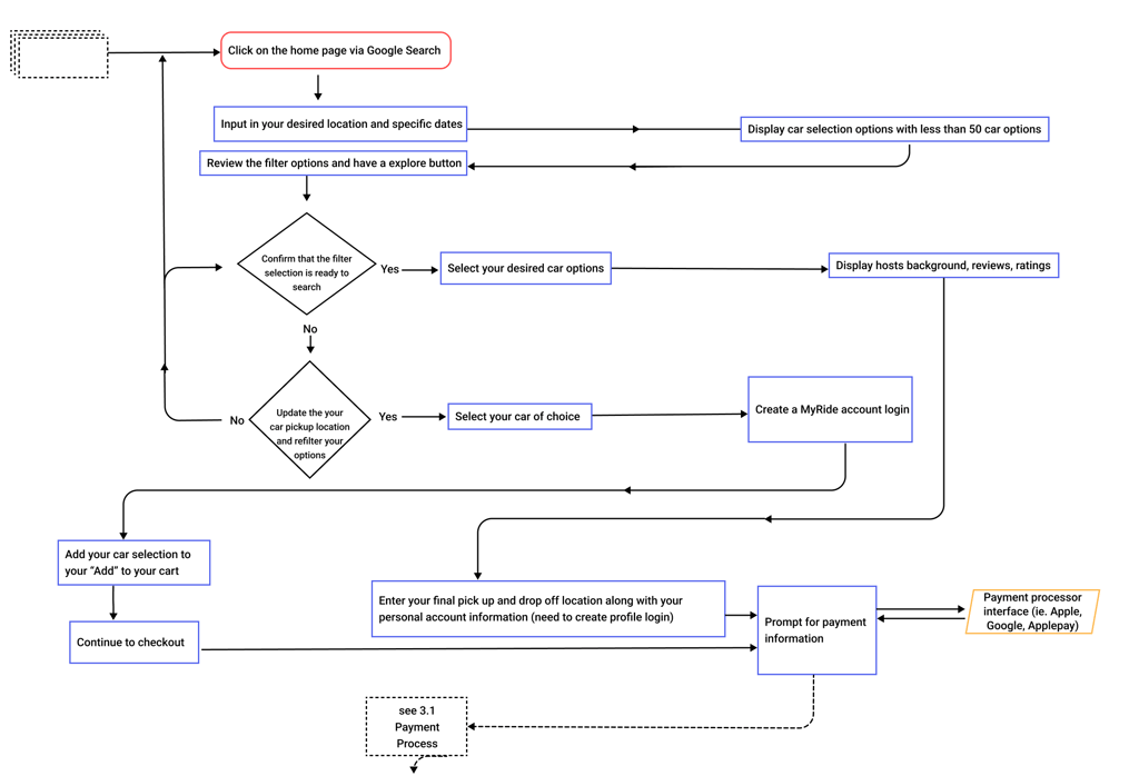
User Flow Chart
This user flow shows how someone books a car on MyRide — step by step. It starts with searching on Google, entering trip details, filtering cars, checking host information, logging in, and ends with checkout and payment. The flow helps us understand how easy or confusing the process might be and where improvements can be made.
Low- Mid- Fidelity Sketches
We designed low- to mid-fidelity wireframes to plan the layout and structure of the app. These wireframes focused on key screens such as search, car details, booking, and checkout. They helped us test ideas early, improve the user flow, and gather feedback before building a high-fidelity prototype.
Price wasn’t clear
The “Reserve” button was confusing
Missing car information (seats, luggage capacity, etc.)
No car highlights
Map felt plain and unclear
No way to ask for more information
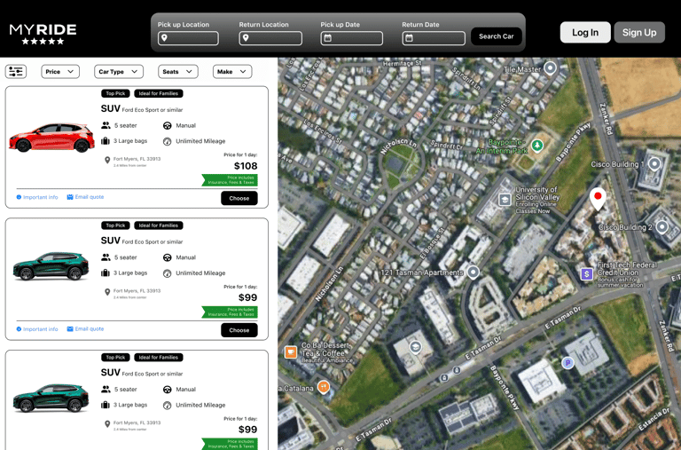
Added a label indicating that the price includes fees and insurance
Changed the button text to “Choose” for better clarity
Added information with icons for easy comparison
Added tags like “Top Pick”
Switched to satellite view with location pins
Added “Important Info” and “Email Quote” buttons
Issue Found (Mid-Fidelity)
Change Made (High-Fidelity)
Issue Found (Mid-Fidelity)
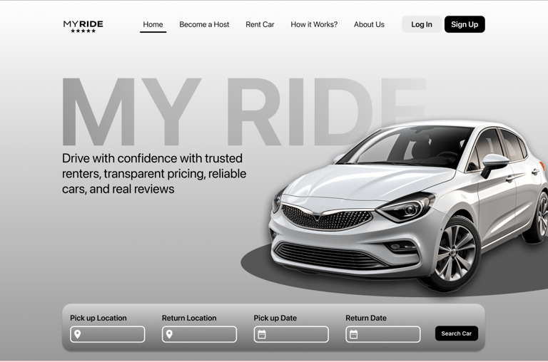
Navigation menu missing – Users didn’t know where to go or how to explore the site.
Search bar was too simple – It lacked clarity for pickup/return locations and dates.
Only one sign-in button – Some users looked for a separate sign-up option.
Design felt too flashy or unrealistic – Luxury cars made it feel exclusive.
Text and buttons felt cramped – Users said layout looked crowded.
Search experience unclear – There were no instructions or flow indicators.
Change Made (High-Fidelity)
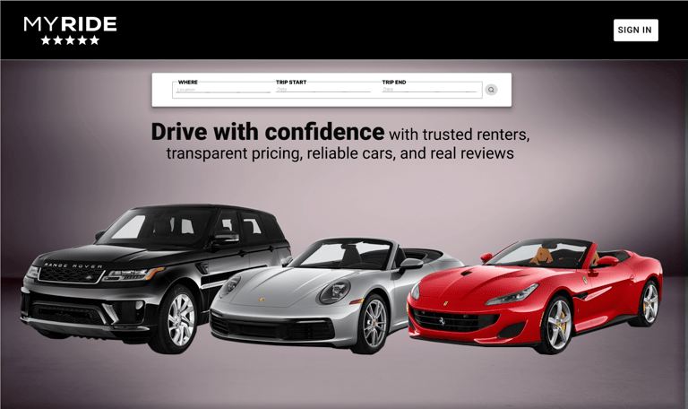
Added a top navigation bar with clear links (Home, Become a Host, Rent a Car, etc.).
Added labeled fields for Pick-up Location, Return Location, and Dates to provide better guidance.
Added both "Log In" and "Sign Up" buttons for clear call-to-action.
Replaced the image with a more relatable car to appeal to everyday users.
Improved spacing, alignment, and visual balance for a cleaner interface.
Added a structured search layout and a "Search Car" button to enhance clarity and flow.
Usability Issues & Changes
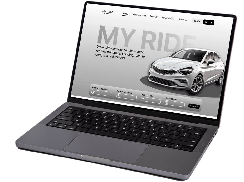
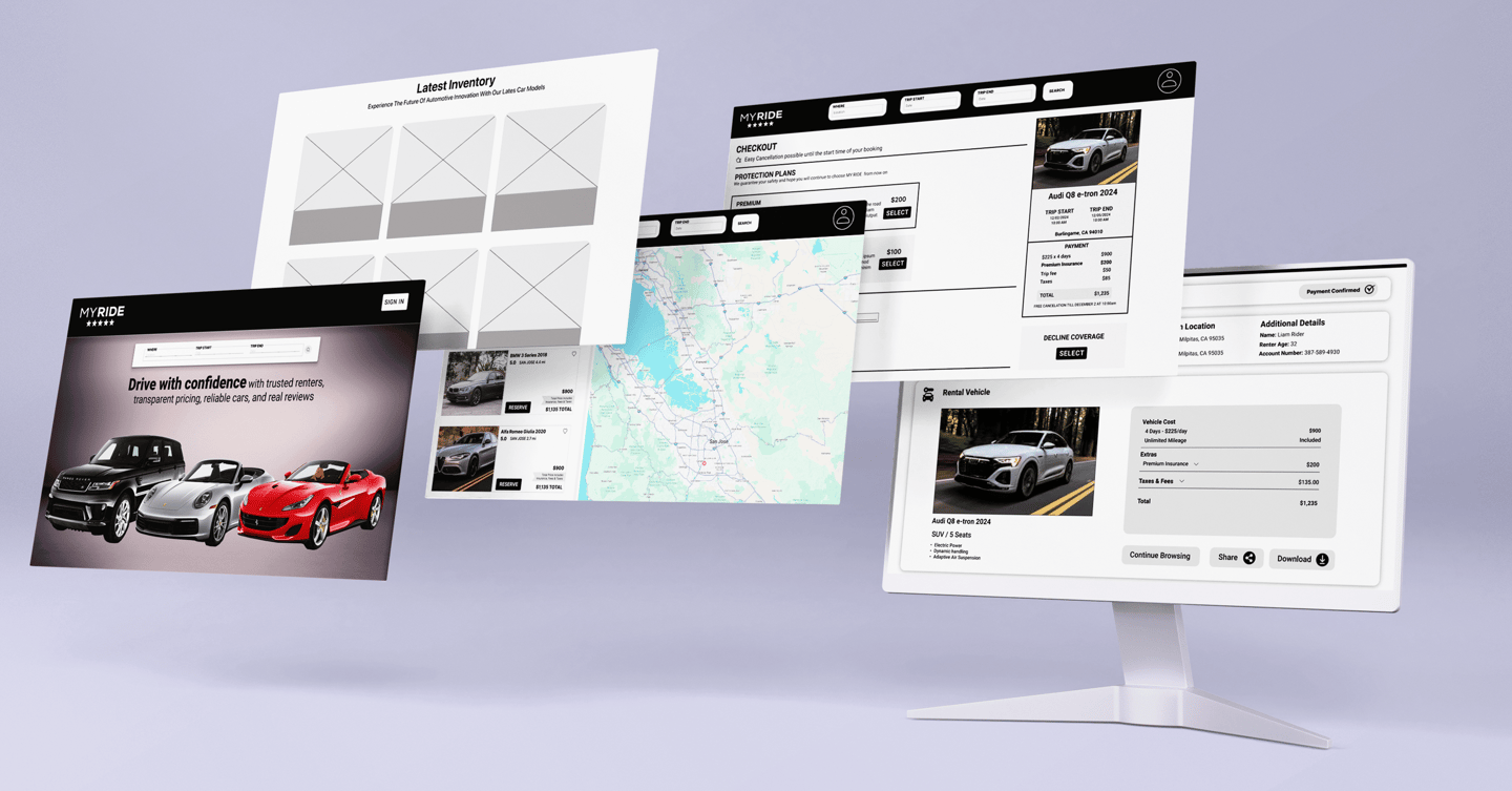
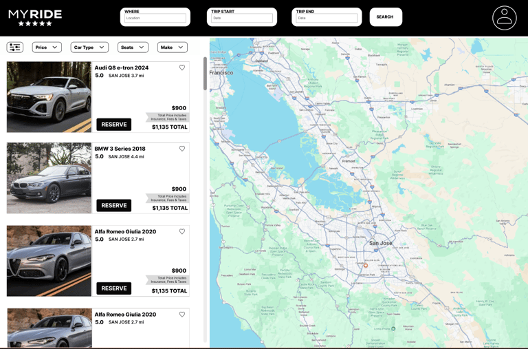
The final website design made car rental simple, clear, and trustworthy. After incorporating user feedback, people found it easy to book a car and understand the full cost without confusion.
Final Impact
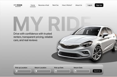
This final design was created after user testing and includes all changes based on feedback. It features the complete website with clear pricing, improved car information, user-friendly buttons, and an enhanced map. It helps users book cars easily and with confidence.
High-Fidelity Prototypes
Reflection & Learning
Talking to users was really helpful — their feedback improved the design.
Early testing showed us what was confusing and what needed to be changed.
We learned to design for different users, such as first-time renters and frequent travelers.
Teamwork was essential — sharing ideas helped us solve problems more quickly.
Key Takeaways:
People want clear pricing with no hidden fees.
Easy steps and helpful information make users feel more confident.
Small changes (like button labels and icons) can make a big difference.
User feedback is powerful – it helps create a better experience.
“Good design starts with listening. The more we understood our users, the better the experience we were able to create.”
View More Work
Exploriq is a mobile app that helps people who are new to a place. It makes it easier to find jobs, explore the city, join local events, and meet new friends - all in one app.